


MODIFIED ON: November 29, 2022 / ALIGNMINDS TECHNOLOGIES / 0 COMMENTS

We are always having a massive amount of data to deal with today. A visual representation is more perfect to express the data in a more meaningful way.
D3 is a successor to the earlier Protovis framework by Mike Bostock and team. Rather than any other libraries, D3.js allows great control over the final visual result and hence can be considered as a flexible way for data visualization.
What is D3.js?
Based on the data provided, the JavaScript library D3.js, manipulates documents. D3 stands for Data Driven Document. D3 helps us to bring life to data by using HTML, SVG and CSS.
We can certainly point out that D3 efficiently focuses on interactions, transitions and transformations which are making it more impressive and thus providing some awesome features for interactions and animations.
Why D3.js?
D3 is told to be data driven as it can use static data or can convert and use it from different formats like Arrays, Objects, CSV, JSON, XML etc… so as to produce different types of charts. Document Object Model (DOM) can be manipulated according to our data with D3.
More than 1000 different charts of D3.js are available on this site. You can easily look and use them for the different graphs you required and can also make changes in codes to get desired graphs.
How to work with D3.js?
As D3 is written in JavaScript someone who has experience in basic JavaScript coding can easily understand and learn it.
If you use npm you can install it as, npm install d3
To link directly to the latest release, you can copy this snippet on to your code:
<script src=”https://d3js.org/d3.v5.min.js”></script>
D3.js Examples
1. Creating Hello world using D3.js
A simple ‘Hello World’ can be displayed with the below code.
d3.select(“body”).append(“span”) .text(“Hello, world!”);
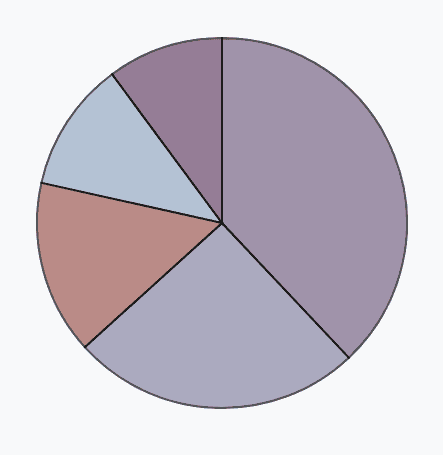
2. Creating a pie chart using D3
For creating a pie chart, you can follow the below code referenced from this site .
Create dummy data.
vardata = {a:9, b:20, c:30, d:8, e:12}
Set the colour scale.
varcolor = d3.scaleOrdinal() .domain(data) .range([“#98abc5”, “#8a89a6”, “#7b6888”, “#6b486b”, “#a05d56”])
Compute the position of each group on the pie.
varpie = d3.pie() .value(function(d) {returnd.value; }) vardata_ready = pie(d3.entries(data))
Build the pie chart: Basically, each part of the pie is a path that we build using the arc function.
svg .selectAll(‘whatever’) .data(data_ready) .enter() .append(‘path’) .attr(‘d’, d3.arc() .innerRadius(0) .outerRadius(radius) ) .attr(‘fill’, function(d){ return(color(d.data.key)) }) .attr(“stroke”, “black”) .style(“stroke-width”, “2px”) .style(“opacity”, 0.7)
3. Creating a directive for D3 when working with Angular
If you are working with Angular you can create a directive that generates a graph and call that directive whenever you need a graph.
Let’s create an angular directive which can be used to generate both the pie chart and the donut chart.
Creating a pie chart and donut chart
Import the libraries required.
import { Directive, Input , Output , EventEmitter} from’@angular/core’; import { ElementRef } from’@angular/core’; import*asD3from’d3′;
CSS selector that identifies this directive in a template here let’s use it as ‘appPiechart’.
@Directive({ selector:'[appPiechart]’ }) exportclassPiechartDirective {
Define the input and output properties.
@Input () chartOption : {};
@Output() piechartUpdated = newEventEmitter
Create the parameters required.
privatehost: D3.Selection
Setup the radius, width and height, here we can provide the outer radius from the component HTML so that each pie chart be of the required size.
privatesetup(): void { this.radius = this.chartOption[‘outer_radius’]; this.width = (this.radius *2); this.height = (this.radius *2); }
Create an SVG to show the pie chart.
privatebuildSVG(): void { this.host.html(”); this.svg = this.host.append(‘svg’) .attr(‘height’, this.height+40) .attr(‘width’, this.width+40) .attr(‘viewBox’, ‘0 0 ‘+(this.width+30)+’ ‘+(this.height+30)) .append(‘g’) .attr(‘transform’, `translate(${(this.width / 2)+7},${(this.height / 2)+ 20})`); }
Function to build the pie chart.
privatebuildPie(): void { constpie = D3.pie() .startAngle(1.1*Math.PI) .endAngle(3.1*Math.PI); this.sum = this.pieData.reduce((a, b) =>a + b, 0); constarcSelection = this.svg.selectAll(‘.arc’) .data(pie(this.pieData)) .enter() .append(‘g’) .attr(‘class’, ‘arc’); this.populatePie(arcSelection); }
Function to modify the pie chart as required.
privatepopulatePie(arcSelection: D3.Selection
Inner radius is defined for the donut chart, in case of pie chart the inner radius will be zero.
constinnerRadius = this.chartOption[‘inner_radius’]; constouterRadius = this.radius; constarc = D3.arc() .outerRadius(outerRadius) .innerRadius(innerRadius);
For each of the arc section drawing, we are to give different colours.
arcSelection.append(‘path’) .attr(‘d’, arc) .attr(‘fill’, (datum, index) => { returnthis.colors[index]; })
The transition for each arc is provided so as to get better animations.
.transition().delay(function(d,i) { returni * 10; }).duration(1500) .attrTween(‘d’, function(d) { vari = D3.interpolate(d.startAngle+0.1, d.endAngle); returnfunction(t) { d.endAngle = i(t); returnarc(d) } });
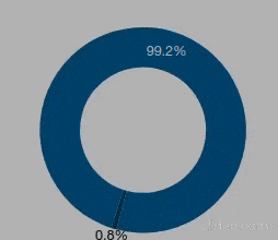
Percentage of the data is shown with the animation on the pie/donut chart for the better understanding.
arcSelection.append(‘text’) .text((datum, index) => { letper = Math.round(this.pieData[index] * 100 / this.sum);return” + per + ‘%’} ) .attr(‘font-size’, 12) .transition() .delay(1000) .attr(‘transform’, (d: any,index) => { d.innerRadius = innerRadius; d.outerRadius = outerRadius / 2; return’translate(‘ + arc.centroid(d) + ‘)’; }) .attr(‘fill’, (datum, index) => { return’white’; } ) .attr(“dy”, “.35em”) .style(‘text-anchor’,(d: any,index) =>{ return”middle”; }); this.piechartUpdated.emit(arcSelection); } }
Now, as we have created the directive let’s call the directive on the component HTML template of angular. We can call the directive name ‘appPiechart’ within division where we require the chart.
Within the input properties ‘chartOption’ we are supposed to provide the data, colour and radius.
For a pie chart give the inner radius as 0
<div class=”pie-container”appPiechart [chartOption]=”{data:pieData, colors:colors, outer_radius:90, inner_radius:0}”id=”c2″></div>

For a donut chart give value to the inner radius.
<div class=”pie-container”appPiechart [chartOption]=”{data:donutData, colors:colors, outer_radius:90, inner_radius:55}”id=”c1″></div>
Conclusion
Easily we could create a pie and donut chart which is animated. Similarly, we can create many more charts with little effort. The wide availability of the different type of animated graph examples of D3 helps to put much effort into creating and modifying for better visualization.
Are you looking for a D3.js consultant? We have an expert team that can assist you with D3.js and Data Visualizations. Contact us now!
Leave a reply
Your email address will not be published.
-
Recent Posts
- Chatbots vs. Conversational AI: Decoding the Mysteries Behind the Tech
- Leading the Pack: The Top Conversational AI Platforms Transforming Communication in 2024
- The Future of Work: Key Remote Staffing Trends Dominating 2024
- The Ultimate Guide to Choosing the Right Generative AI Company
- How to Cut Through the Hype: A Practical Guide to Generative AI for Businesses
-
Categories
- MVP Development (3)
- AlignMinds (55)
- Operating Systems (2)
- Android POS (3)
- Application Hosting (1)
- Artificial Intelligence (18)
- Big Data (2)
- Blockchain (1)
- Cloud Application Development (7)
- Software Development (30)
- Software Testing (9)
- Strategy & User Experience Design (4)
- Web Application Development (23)
- Cyber Security (6)
- Outsourcing (7)
- Programming Languages (3)
- DevOps (5)
- Software Designing (6)
- How to Code (4)
- Internet of Things (1)
- Machine Learning (2)
- Mobile App Marketing (4)
- Mobile Application Development (18)
- Mobile Applications (5)